Ever landed on a website and felt an instant urge to click “shop” or “sign up”? That’s color working its magic. Colors don’t just prettify—they shape emotions, steer actions, and keep users glued. For businesses hungry for conversions, choosing the right palette is a blend of psychology and artistry. Here’s how to master it.
What Is Color Theory?
Color theory is your guide to mixing hues that pop. It’s the backbone of visuals that linger in the mind. The core:
- Primary colors (red, blue, yellow) are your foundation.
- Secondary colors (green, orange, purple) come from blending primaries.
- Complementary colors (like red and green) sit opposite on the color wheel, ideal for bold contrast.
But don’t stick to the basics. Expert web design services twist these rules to fit a brand’s soul. A trendy fashion brand might pair coral with midnight blue, while a nonprofit opts for earthy greens and warm beige. It’s about merging classic principles with modern trends, like vibrant gradients or sleek single-color schemes.
The Psychology of Colors
Colors hit you fast. Red screams “now!”—think flash sales. Blue radiates trust, a staple for banks. Green feels fresh, tied to growth or sustainability. But context changes the game.
Yellow might energize a kids’ brand CTA, but it’s a miss for a luxury spa, where soft ivory or deep emerald shines. Your audience and product steer the palette. This is where web design services excel, nailing the nuances. Research shows 90% of snap judgments about products are color-driven, so picking hues that resonate is critical.
A skilled website designer starts with intent: What action do we want? Then they pick shades that nudge subtly. Think bright oranges and reds for food apps to spark appetite, or calming blues and greens for wellness platforms to feel serene.
Palettes That Drive Results
Want users clicking like it’s a contest? Your palette needs balance and purpose. Try this:
- 60% base color: Your brand’s core shade.
- 30% secondary hue: Adds depth (like white with navy).
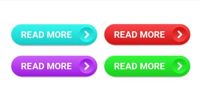
- 10% accent color: For buttons or links—vivid but tasteful.
Tools like Coolors or Adobe Color speed up the process, but human intuition takes it further. AI can suggest trendy combos, but it lacks the audience insight a pro website designer brings.
Contrast is king. Light text on a pale background? A strain to read. WebAIM’s Contrast Checker ensures clarity. Accessibility matters—4% of people have color vision issues, so pair similar hues with textures (like grids versus stripes) in visuals like charts.
Real-World Wins
Proof in action:
- Retail: H&M’s red buttons leap off clean white, driving sales.
- Health: Soft greens and creamy whites in meditation apps feel soothing.
- Tech: Dark themes with neon blue accents scream “next-gen.”
Web designer Singapore use A/B testing to confirm choices. One test showed a button switching from green to orange boosted conversions by 20%. Small tweaks, big payoffs.
The Human Spark
Design tools promise “perfect” palettes, but great color choices tell a story. A website designer dives into your brand’s essence, crafting visuals that connect. AI might churn out a mockup, but humans weave the emotion.
Pros still leverage tech. Plugins flag low-contrast issues; others scan competitor palettes for fresh angles. Blend tech’s precision with human flair, and you’re set. Designers often pitch multiple palette options, tying each to your goals before locking in.
Final Takeaway
Ditch bland templates. Strategic color turns browsers into buyers. Hire web design services or, if DIY-ing, keep it tight: High contrast, minimal hues, and colors that evoke the right emotions.
Your site’s palette isn’t just visuals—it’s your silent closer. Make it work.